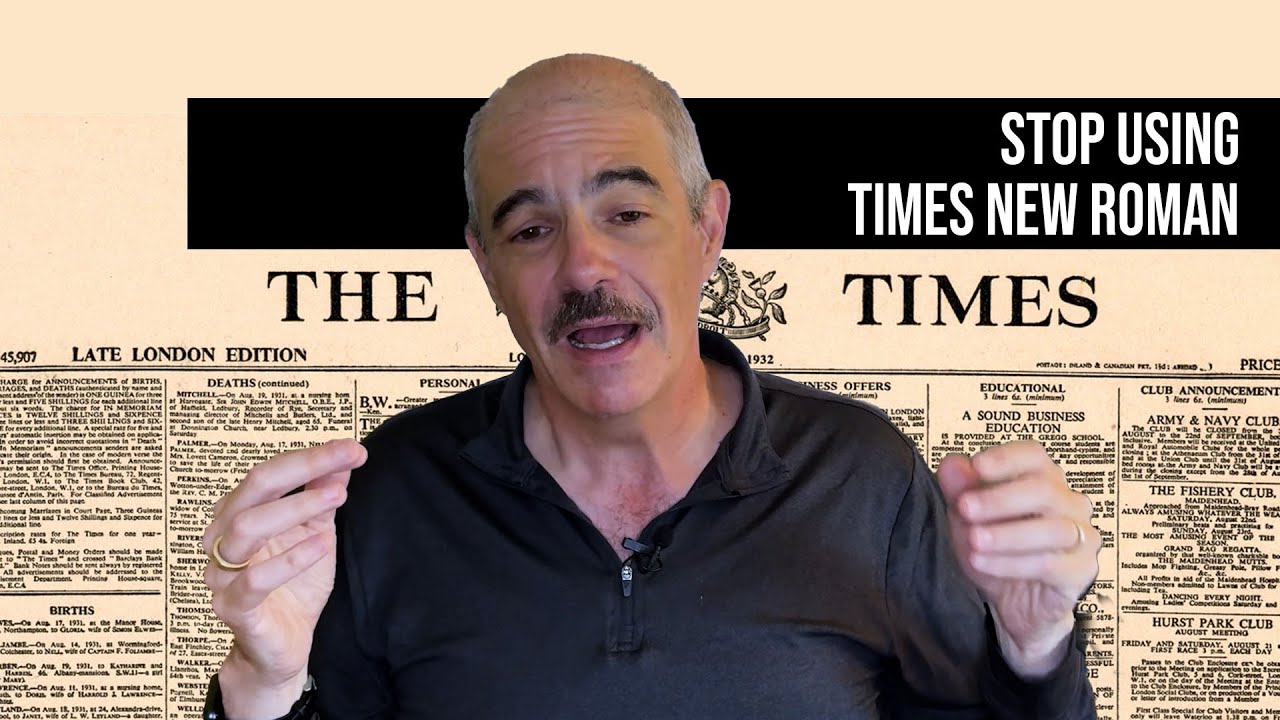
The Font Face-Off: Times New Roman vs Calibri for the State Department
The debate highlights the often-overlooked importance of font design in government communications. **Times New Roman**, a serif font, has been used by the State
Summary
The debate highlights the often-overlooked importance of font design in government communications. **Times New Roman**, a serif font, has been used by the State Department since 2004, while **Calibri**, a sans serif font, was introduced in 2023. The switch back to **Times New Roman** has sparked a discussion about the role of font design in conveying information effectively. [[font-design|Font design]] is a nuanced field, with many factors influencing the legibility and readability of text. [[government-communications|Government communications]] rely heavily on clear and effective messaging, making the choice of font a critical consideration. [[typeface-design|Typeface design]] experts like **Sofie Beier** and **Tobias Frere-Jones** emphasize the importance of considering the context in which text will be read, including the medium and the audience.
Key Takeaways
- The State Department switched from Calibri to Times New Roman in December 2025
- The switch has sparked a debate about the importance of font design in government communications
- Times New Roman is a serif font, while Calibri is a sans serif font
- The impact of the switch on the effectiveness of State Department communications is not yet clear
- Font design experts must consider the context in which text will be read, including the medium and the audience
Balanced Perspective
The switch from **Calibri** to **Times New Roman** is a matter of personal preference, and both fonts have their strengths and weaknesses. **Lucas de Groot**, the creator of **Calibri**, defends his design, while **Tobias Frere-Jones** questions the reasoning behind the switch. The debate highlights the complexity of font design and the many factors that influence legibility and readability. **Sam Berlow** notes that the research on font design is not always conclusive, and that different fonts perform better in different contexts. The switch may not have a significant impact on the effectiveness of State Department communications, but it has sparked an interesting discussion about the importance of font design. [[font-legibility|Font legibility]] is a complex issue, and there is no one-size-fits-all solution. [[type-design|Type design]] experts must consider many factors when designing fonts for government communications.
Optimistic View
The switch to **Times New Roman** could be seen as a positive move, as it may improve the legibility and readability of State Department communications. **Sofie Beier** notes that serif fonts like **Times New Roman** can be more readable in certain contexts, and **Sam Berlow** argues that **Times New Roman** is not the worst choice, despite its limitations. The debate surrounding the switch has also highlighted the importance of font design in government communications, which could lead to a greater emphasis on effective typography in the future. [[font-design|Font design]] experts may see this as an opportunity to promote better font design practices in government communications. [[state-department|State Department]] officials may also benefit from the debate, as it could lead to a more informed approach to font selection.
Critical View
The switch to **Times New Roman** may be a step backwards, as **Calibri** was designed to be more readable in digital formats. **Lucas de Groot** notes that **Calibri** was designed with digital reading in mind, and that **Times New Roman** may not be as effective in this context. The debate surrounding the switch has also highlighted the potential for font design to be used as a distraction from more important issues. **Tobias Frere-Jones** questions whether the switch is a distraction from the State Department's actual work, and **Sam Berlow** argues that **Times New Roman** is not a great performer compared to other fonts. The switch may ultimately have a negative impact on the effectiveness of State Department communications. [[government-communications|Government communications]] rely heavily on clear and effective messaging, and the choice of font can have a significant impact on this. [[font-design|Font design]] experts must carefully consider the context in which text will be read, including the medium and the audience.
Source
Originally reported by The New York Times