Times New Roman Font Is Back — and History Is Rolling Its Eyes
The debate surrounding the return to **Times New Roman** highlights the complex relationship between design, government, and communication. While some argue tha
Summary
The debate surrounding the return to **Times New Roman** highlights the complex relationship between design, government, and communication. While some argue that the font is a classic and timeless choice, others see it as a relic of the past. The decision is also raising questions about the role of government in shaping design standards and the potential impact on accessibility and readability. [[government-spending|Government spending]] on design and communication is also under scrutiny, with some arguing that the decision is a waste of taxpayer dollars. As the debate continues, it remains to be seen how the return to **Times New Roman** will affect the way government documents are perceived and used by the public.
Key Takeaways
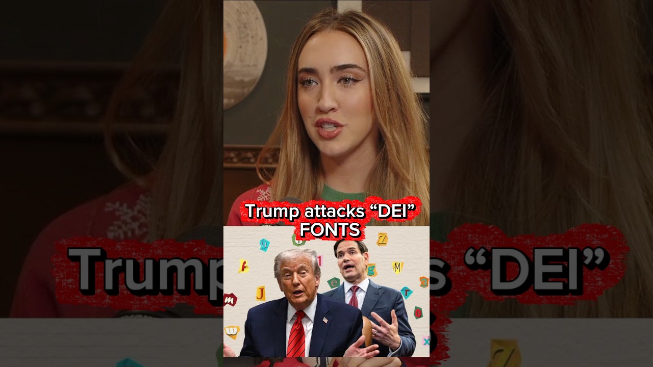
- The State Department has announced a return to Times New Roman as its official typeface
- The decision bans the use of sans serif fonts
- The decision has sparked debate about design, government spending, and accessibility
- The American Institute of Graphic Design has expressed disappointment with the decision
- The decision has significant implications for the way government documents are presented and perceived
Balanced Perspective
The decision to return to **Times New Roman** is a complex issue with both positive and negative aspects. On the one hand, the font has a long history of use in government documents and is widely recognized as a standard for official communications. On the other hand, the decision has been criticized by many in the design community, who argue that **sans serif** fonts are more modern and accessible. [[design-community|Design community]] experts point out that the decision may be seen as a step backward, and that it could have a negative impact on the way government documents are perceived and used by the public.
Optimistic View
The return to **Times New Roman** could be seen as a positive step towards creating a more consistent and recognizable visual identity for the **State Department**. The font has a classic and timeless quality that could help to establish a sense of tradition and stability. Additionally, the decision could be seen as a way to simplify and streamline government communications, making it easier for citizens to navigate and understand official documents. [[branding|Branding]] experts argue that a consistent visual identity is essential for building trust and credibility, and the return to **Times New Roman** could be a step in the right direction.
Critical View
The return to **Times New Roman** is a misguided decision that will have a negative impact on the way government documents are presented and perceived. The font is outdated and lacks the modern and sleek quality of **sans serif** fonts, which are widely used in contemporary design. The decision is also a waste of taxpayer dollars, as it will require significant resources to implement and maintain. [[government-waste|Government waste]] is a serious issue, and the decision to return to **Times New Roman** is a prime example of how government spending can be misallocated.
Source
Originally reported by Katie Couric Media